mall of america's rebranding

Mall of America opened in 1992 in Bloomington, Minnesota. It remains the largest retail and entertainment complex in the country. Attracting 42 million visitors annually, MOA has 520 shops, an indoor amusement park with 27 rides, an indoor aquarium, a 14 screen movie theater, and a chapel that weds over 300 couples a year. Yesterday, MOA introduced its new identity designed by Minneapolis-based Duffy & Partners. Duffy is recognized globally for excellence in design. Some of their clients include Coca-Cola, American Eagle Outfitters, Fisher-Price, Jack in the Box, Sony, Toyota, and Whole Foods among other high-profile brands.
In MOA’s press statement, they say “we are always new, constantly changing to offer the latest, hottest, and most memorable experiences to our guests. Therefore, we are moving away from a static logo and incorporating a dynamic colorful design, making use of innovative digital media.” Less “America” and more “mall”. The new logo is designed to adapt to occasions, such as silver and gold versions for holiday season, and American flag colors for Independence Day.
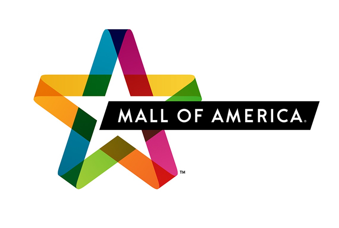

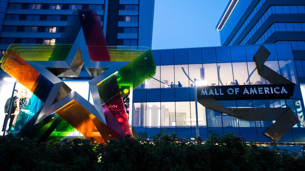
With the logo comes a new tagline: “Always new.” In the past five years, MOA has spent $25 million in renovations and upgrades as they introduce new retailers, exhibits, rides and events. They say the new vibrant star will appear on everything from billboards to trash cans while employees wear new bright uniforms helping guests identify staff.
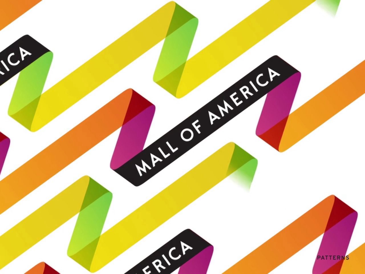
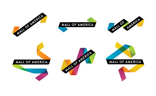
This new logo is a more sophisticated version of the old star and stripes with its appropriate pattern use for communication materials. Watch the video to see the logo in action: